Pendleton Community Bank - Rebranding Concept
Project Description
Pendleton Community Bank - Rebranding Concept
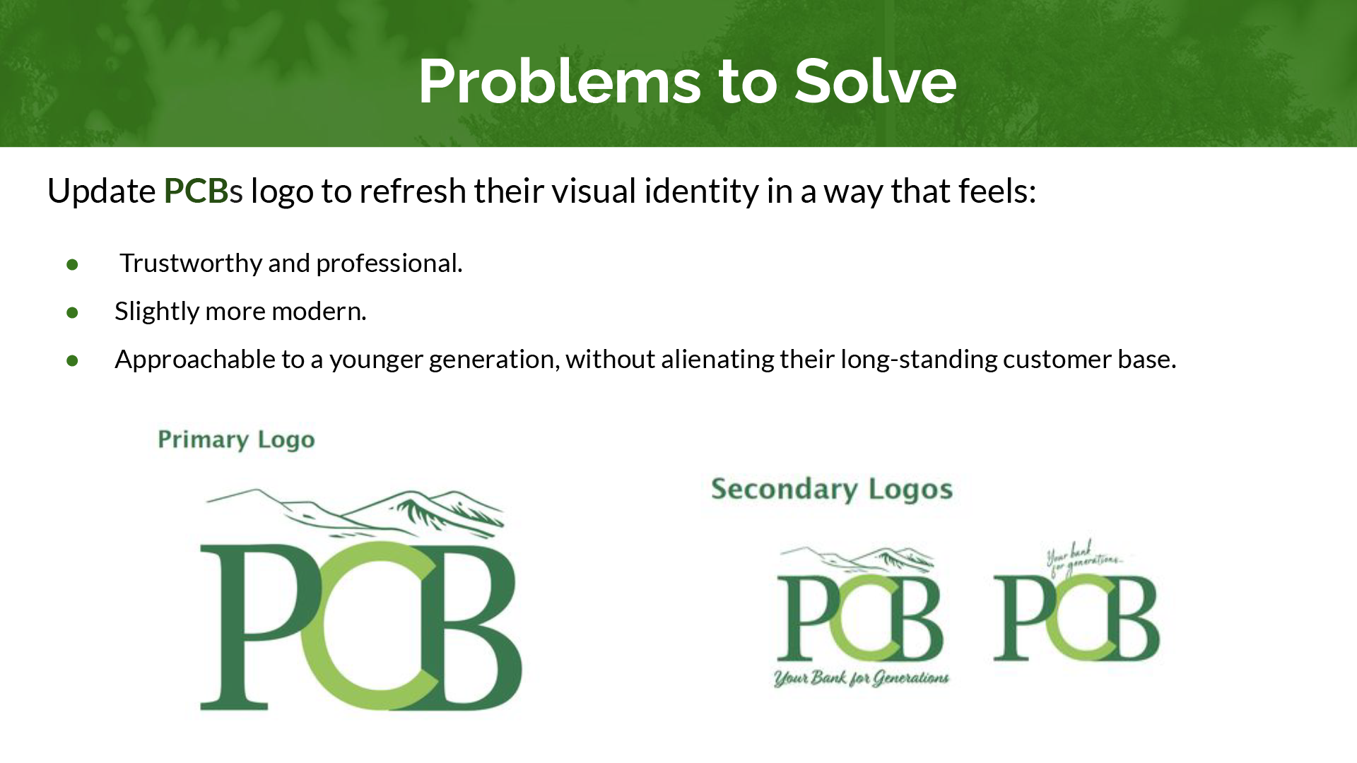
This speculative rebranding project was created as part of a design challenge during the interview process for a Graphic Designer role. While not an official commission, the work showcases my ability to respond to real-world prompts with strategic, client-focused design. Using Adobe Illustrator and Photoshop, I developed a refreshed logo system, front-and-back business card designs, a clean letterhead layout, and a presentation pitch. The goal was to modernize the bank’s visual identity while preserving key elements of its existing brand—striking a balance between familiarity and fresh appeal. This project reflects my thoughtful approach to branding and my ability to deliver cohesive, professional design solutions under tight parameters.
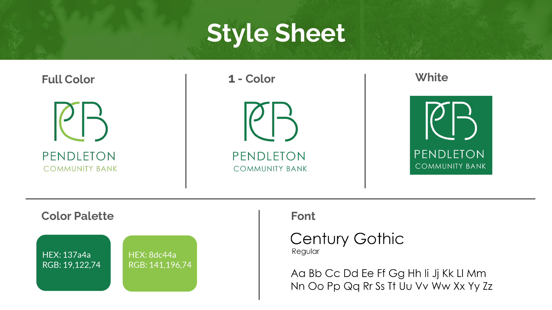
Color Palette


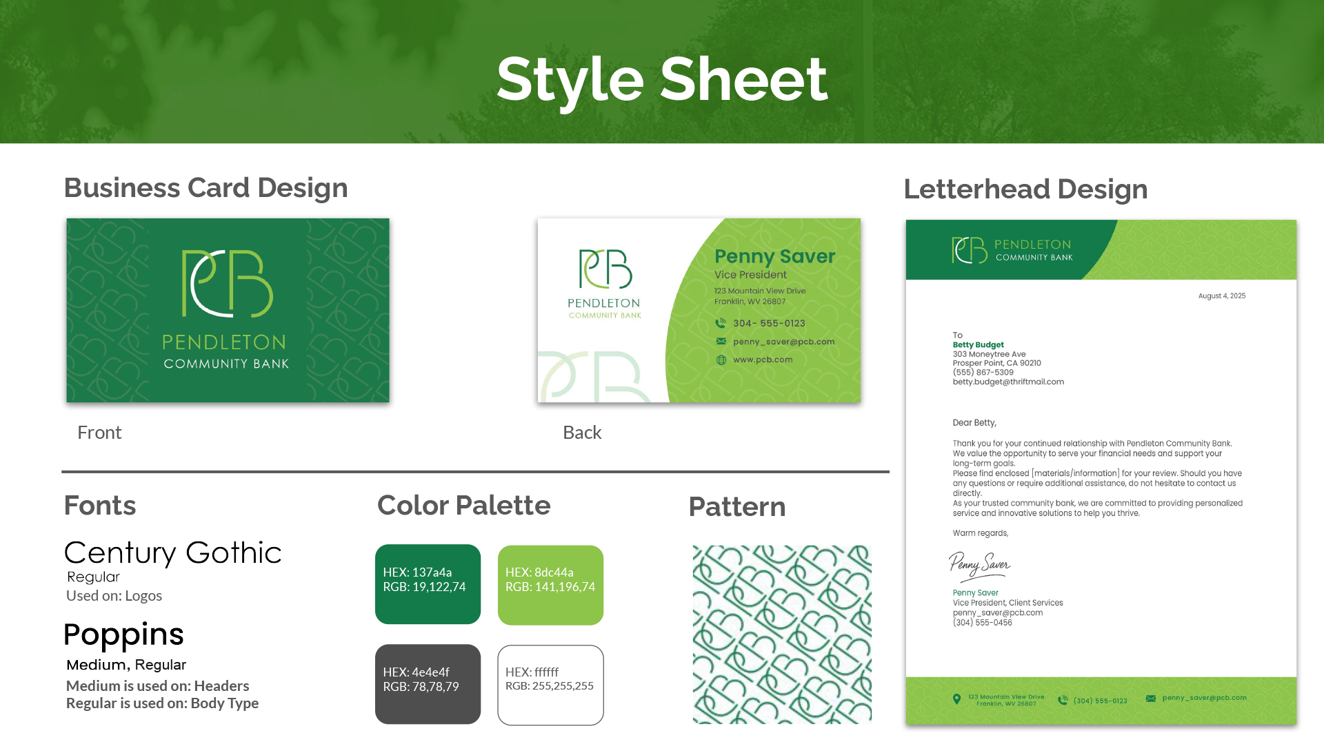
Branding Elements
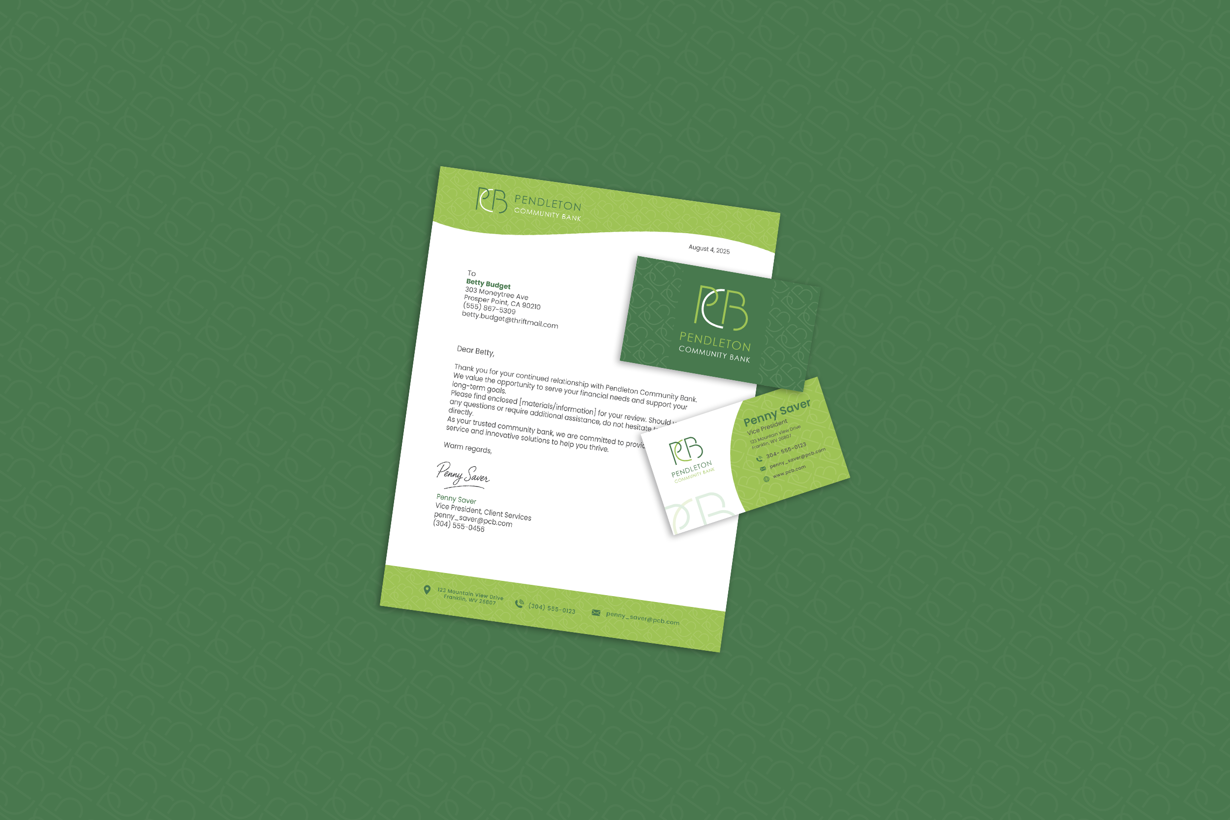
This section showcases how the reimagined logo and supporting brand patterns could be applied across key materials, including letterhead and business cards. These examples highlight the cohesive visual language developed for Pendleton Community Bank—designed to feel polished, professional, and consistent across touchpoints.


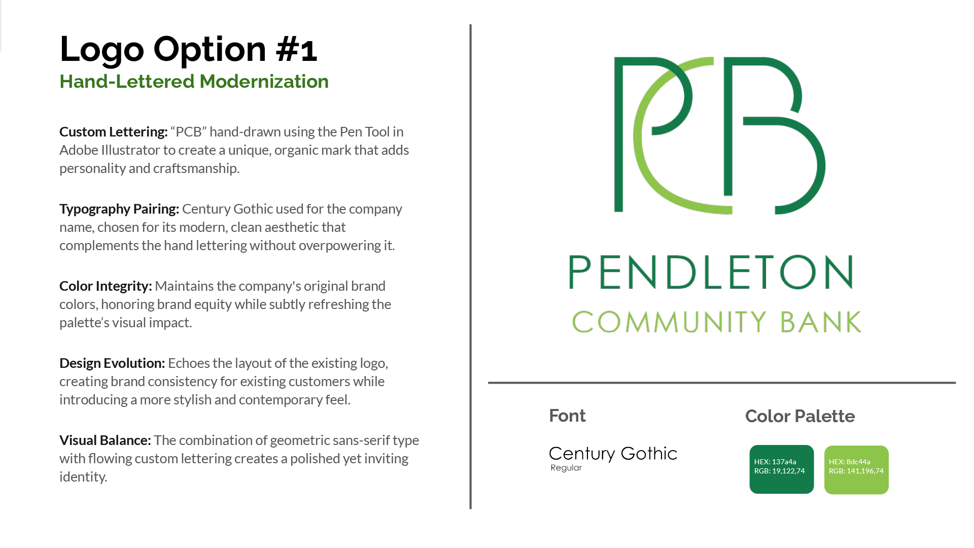
Logo Design
To reimagine Pendleton Community Bank’s visual identity, I developed a range of logo concepts—each designed to feel fresh, trustworthy, and familiar. The final mark and supporting options showcase a strategic blend of heritage and modern design thinking.
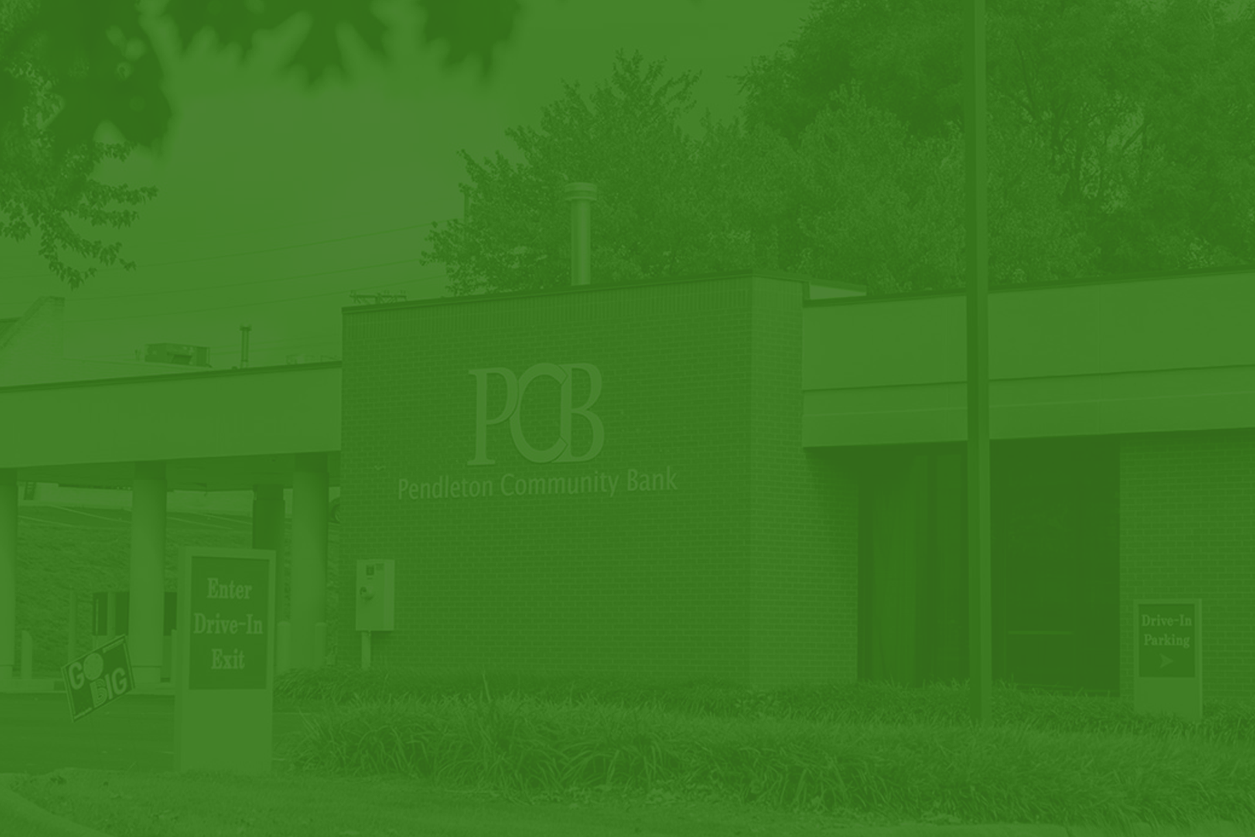
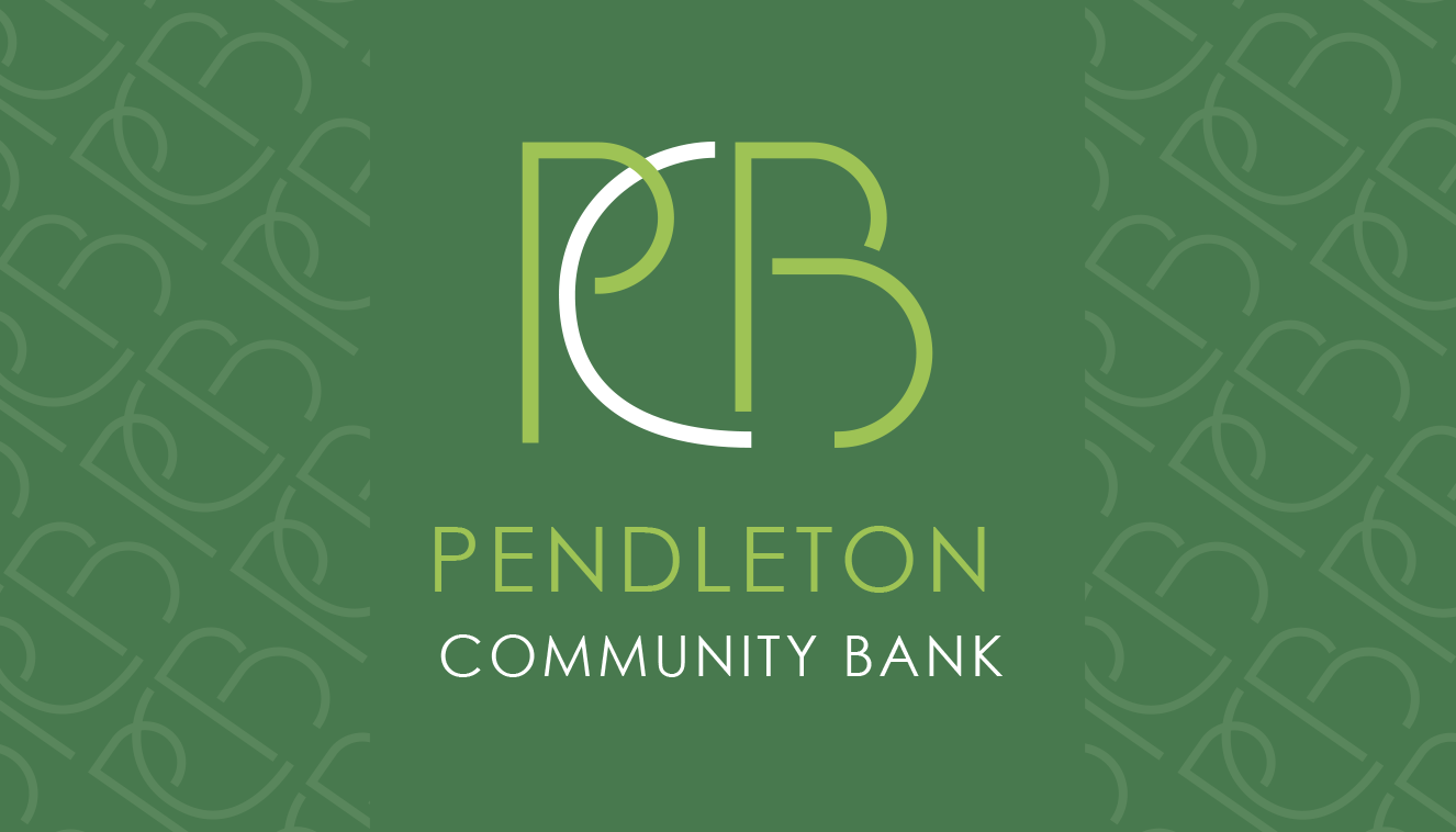
Final Logo Design
Other Logo Designs
Presentation Pitch
Featured here are select slides from the pitch I presented during the interview process. The presentation outlines my design rationale, logo exploration, and branding applications, offering a behind-the-scenes look at how I approached the rebranding challenge with strategy and creativity.